


RENTY .
A streamlined online platform designed to simplify the process of locating ideal long-term rental accommodations.
ROLE
As Lead UX/Ul Designer, I outlined the process for discovering and implementing what would be possible for the company in order to create a successful MVP product that can offer continuous enhancements for a higher yield. This included conducting research for stakeholders to agree with pilot features and a phased approach for later functionality. I led the team, and stakeholders, towards an organized and streamlined experience for tenants to search, favorite, and apply for their ideal rental accommodations.
TIMELINE
Dec 2022 - Jan 2022
TOOLS
Figma
Miro
GAPS IN THE LONG TERM RENTAL SPACE
There is a gap in the market for long term subleasing, in which tenants must actively and independently work to find an ideal space, organize their listings, and communicate with landlords. Renty is for and because of the users, designed to be an enjoyable and reliable experience when it comes to the hardships and anxieties of finding the perfect long-term stay. Other competitors primarily answered to short term use cases, leaving a large user group unanswered for that we intended to be a voice for.
A SINGULAR EXPERIENCE FROM SEARCH TO LEASE RENEWAL
We enhanced the entire experience for our renters, ensuring that every step would be accessible and enjoyable through our product. From the initial search, signing the lease, and to lease renewal- we wanted to combine all the external identities into one reliable space.
OUR GOALS
-
Design an inviting, fun, and reliable service
-
Define user workflows, struggles, and needs
-
Originate a singular experience

DYNAMIC LISTING
For a personalized experience that answers to the endless scrolling through hundreds of listings, we enabled users to select their preferred view type from a list or grid structure. To ensure our system would produce the listings just right for our users, we included the most sought after filtress from our users (i.e location, stay type, price range, etc.)
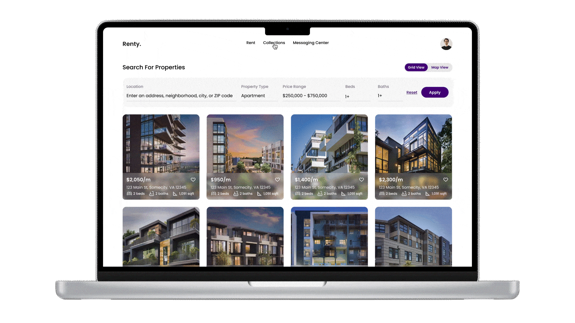
COLLECTION PAGE
Our users exposed us to the true headache that is documenting all your preferred listings. To aid this user struggle, we created a page where users can group all their favorited listings in different collections for easier organization and accessibility. As users scroll through listings, they are able to favorite and add a listing to the selected collection.

SIMPLE INQUIRY
Designed with the requirement of simplicity, we created a simple application for the inquiry process, allowing users to take the 1st step into the subleasing journey stress free.
COMPETITORS AND USERS, OUR WAY TO ADVANCE THE GAP
Both market research and user research was needed to ensure the products success in advancing this market gap. Thus, I conducted an intensive competitive analysis in order to dive into the root of our users shortcomings but as well as their current successes.
SELECTED RESEARCH STRATEGIES
-
Competitive Analysis
-
User Interviews
-
User Personas
-
Streamlined User Flow
COMPETITIVE ANALYSIS
For this competitive analysis, I wanted to analyze the true market value of having an all in one application that provides users with 3 main services (a listing site, a roommate finder, and a property management portal). I was concerned that having an all in one product for MVP would lead to inevitable lack of efficiency from all 3 sides, so I wanted to synthesize how other competitors showcase their service, their potential failures and successes and where Renty could improve.
My research was divided by the service, and further evaluated by tasks that would be conducted within my client’s application for each service. Some questions were “Can the user favorite a listing?” and “Can the user inquire about a leasing?”. Through my research, I was able to find strengths and weaknesses in all competitors- which solidified my reasoning for focusing to perfect 1 service, and thereafter adding in more functionality.
I found that most platforms focused on ensuring that their primary service goal was accomplished before adding on additional services. Airbnb excelled as a listing site, their functionalities were intuitive, efficient, and accessible. RentRedi and Buildium also were successful in property management portals, allowing users to easily access all information and entities within property management. However when evaluating applications that had both services of Listing and Property Management, specifically Zillow and Apartments.com, we see a decrease of high-functioning and efficient UI for both services. In order to add on the additional service of property/rental management, Zillow and Airbnb are sacrificing their primary service of being a listing tool.


USER INTERVIEWS
The competitive analysis brought major discovery to the need to shift our focus and product solutions to just users in search for a long term rental, and with this new direction we conducted user interviews to gain further understanding of users current struggles and frustrations in the rental search process. Not only was this an opportunity to meet with our users, but it shed immense light on their expectations for the product and the features that would alleviate their common difficulties.

A GLIMPSE OF OUR USERS
After thoroughly understanding our users, we designed user personas to solidify our research and become a grounding for future research as well as to provide a visual representation of our learnings to our stakeholders. This reinforced that the project redirection was a necessity for success and made the stakeholders feel more confident in the product decision.


AN IMPROVED AND STREAMLINED USER FLOW
To ensure we saw all our users pain points while formulating a singular improved experience, we documented each step in the process with a User Workflow. Doing so, we were able to visualize our product for the true value that we were bringing to our users. In future phases we plan to conduct more research when implementing the initial desired features such as rental management and roommate finder, thus our workflow will be much more complex in future iterations.

BRAND IDENTITY
In crafting our brand guide, we prioritize trust, communication, consistency, and simplicity. By adopting purple as our primary color, a unique choice in our industry, we aim to stand out and evoke feelings of innovation and sophistication. Every element is meticulously designed to convey reliability and professionalism, resonating deeply with our audience.


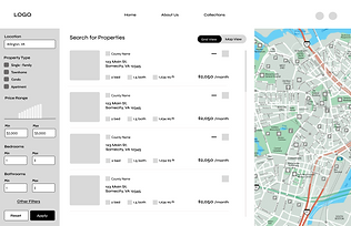
WIREFRAMES
When crafting our low-fidelity wireframes, we prioritized structure to ensure a clear and intuitive layout for users to navigate seamlessly. Our wireframes also focused on intuitive interactions and user flows that prioritize ease of use and accessibility. With emphasis to streamline the rental search, we highlighted essential functionalities such as property search filters and intuitive navigation menus, guiding users to discover their ideal home effortlessly. We highlighted some of the feedback from our stakeholders for the main page, which you can see solutionized on the final designs.

ASKED FOR AN ADDITIONAL 'PROPERTY TYPE' FILTER
PREFERRED ROUNDED BUTTONS
NEED CTA TO LEAD TO LOG IN/SIGN UP
INCLUDE METRICS OF SUCCESS FOR INCREASED RELIABILITY
WANTED THIS PORTION TO EMPHASIZE LUXURY AND UNIQUE VALUES, PROPOSED DESIGN WAS TOO STANDARD
INCLUDE PROPERTY IMAGE, CONTACT/ADDRESS INFORMATION, AND DIRECTORY


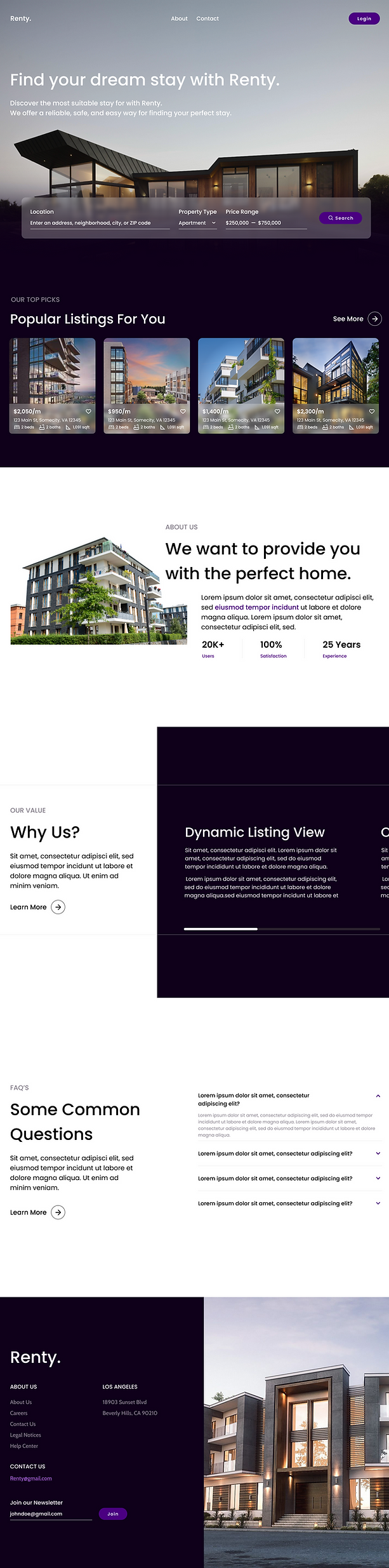
FINAL DESIGNS
With the branding of the product finalized, we implemented everything that makes our product unique into the designs to create the final prototype in both desktop and mobile resolutions. The result is a modern, enjoyable, and simple interface that reflects brand personality.


THOUGHTS AND REFLECTIONS
SUCCEED THEN EXCEL
The original scope of the product encompassed a great value of facets of the rental process. Thus, with our competitive analysis the UX team had to communicate to stakeholders what was needed for success now, and what was feasible for future iteration given the project deadline.
THE MORE THE BETTER
While producing our user interview questions, the team intentionally aimed to create more questions than what we believed we would have time to discuss. This allowed the team to have a monitored yet comfortable conversation with our users in order to yield higher value insights.
WHAT'S NEXT?
The project was requested to pause since delivery of the final hi-fidelity prototypes due to external dependencies, however the company intends to invest to continue building out the phases of the product in which they will reconnect to continue this project!